URIAGE summer PROJECTS
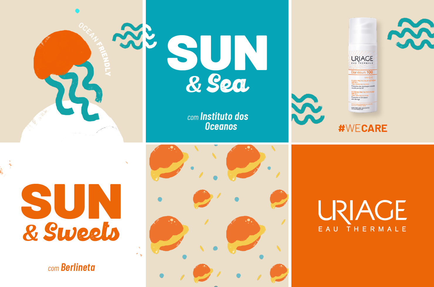
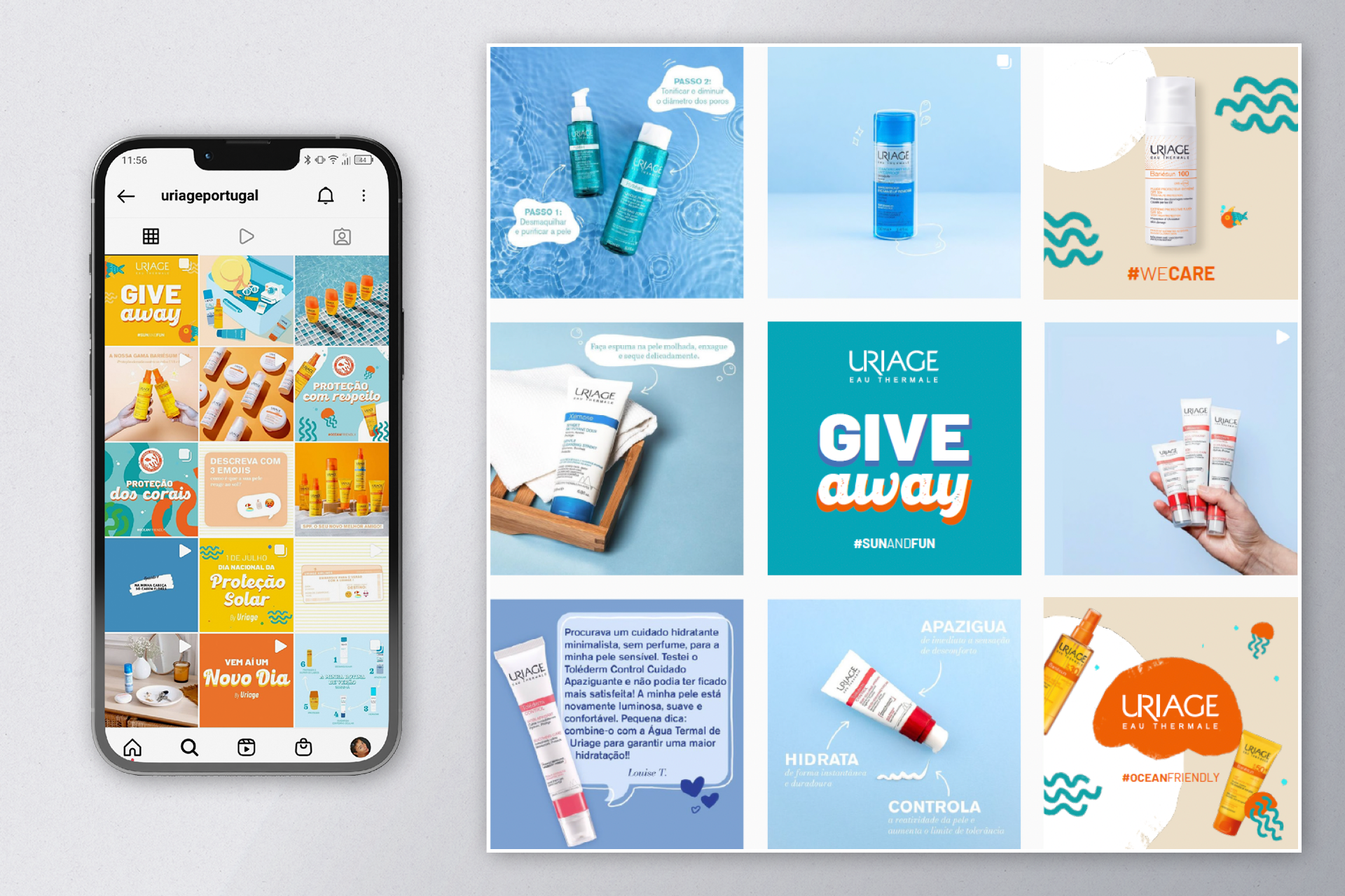
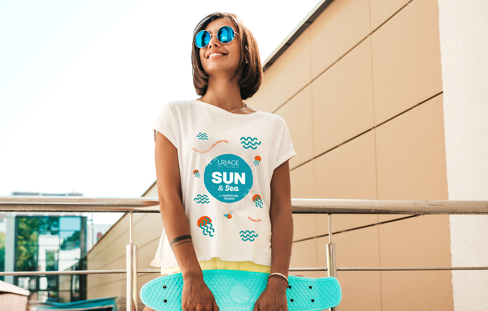
We were invited by Uriage Portugal to create the image for a specific project – a partnership between this dermocosmetic brand and Berlineta (a Berliner's producer and local seller), in order to create awareness around Uriage and establish it even more as a summer brand. Beside a logo, we were asked to create selling points decor, as well as social media content. This was a team project where I mainly contribute with the overall concept, logos design, merchandising and client management and presentation.

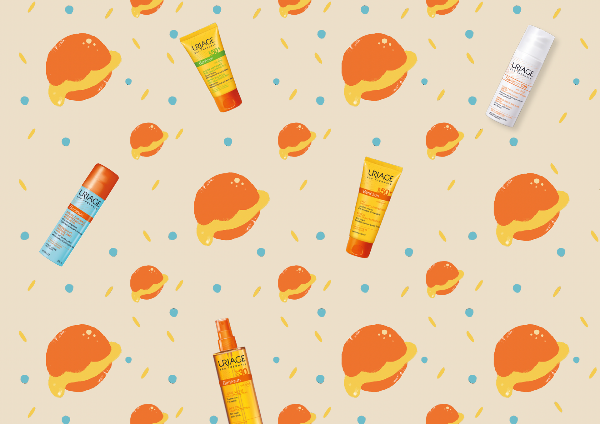
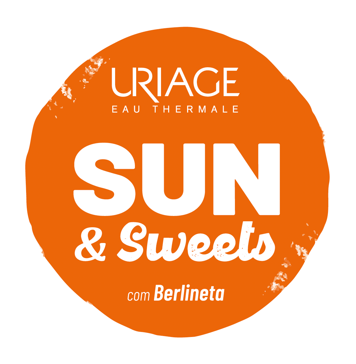
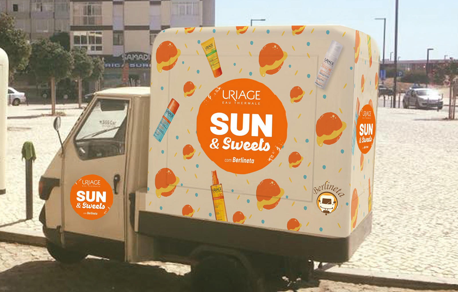
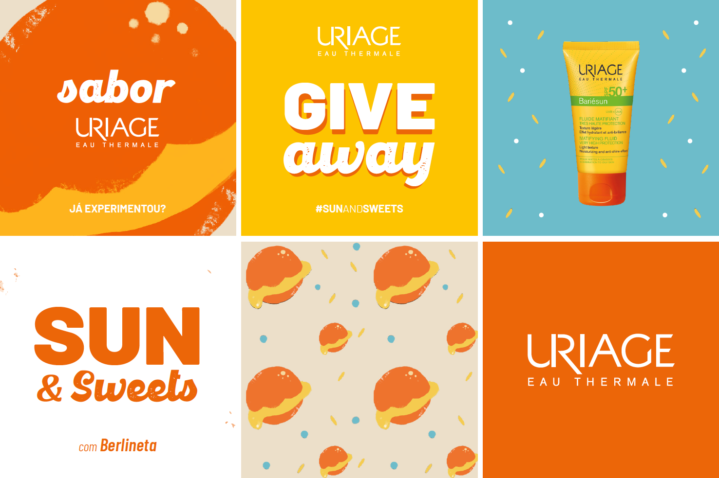
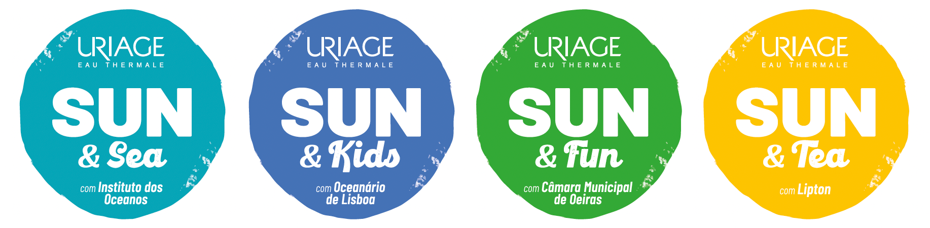
Although the briefing focused exclusively on the current Uriage-Berlineta's project, we knew that the brand aimed to go further with this kind of partnerships. Therefore, instead of looking to this project as a single one, we decide to broaden the briefing and focus on the overall growth potential, such as possible future partnerships and other Uriage goals, policies and ambitions.
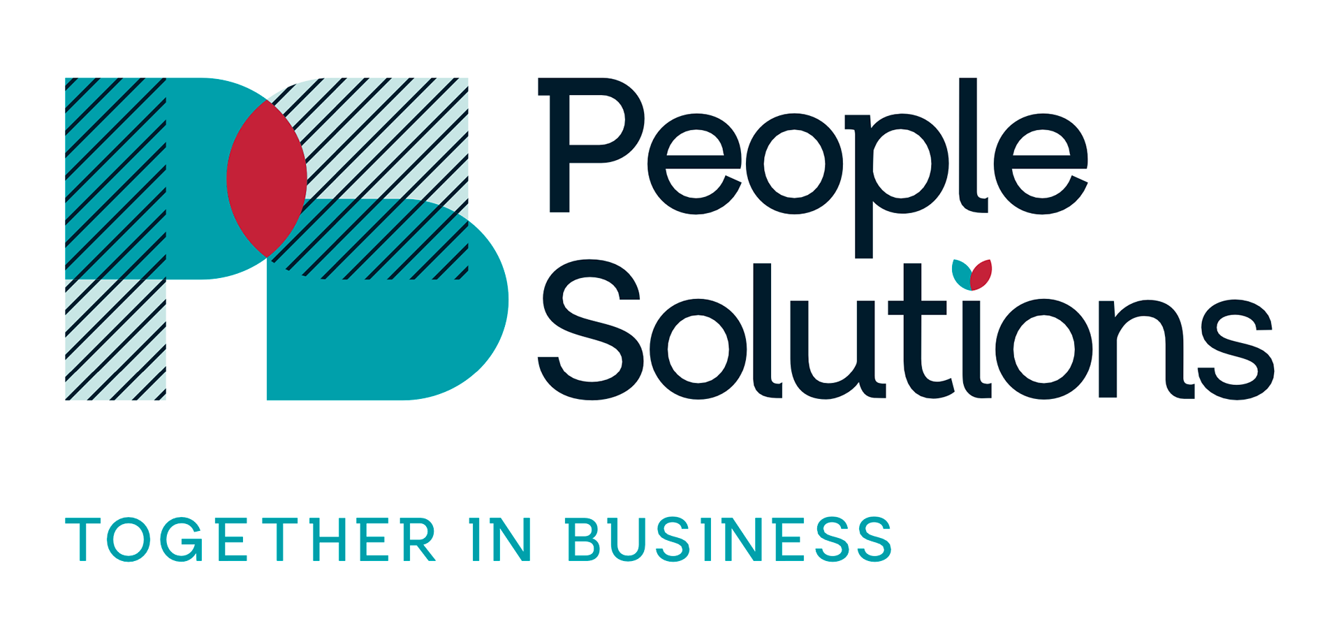
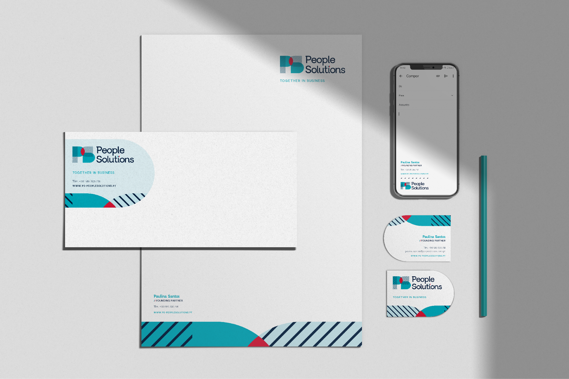
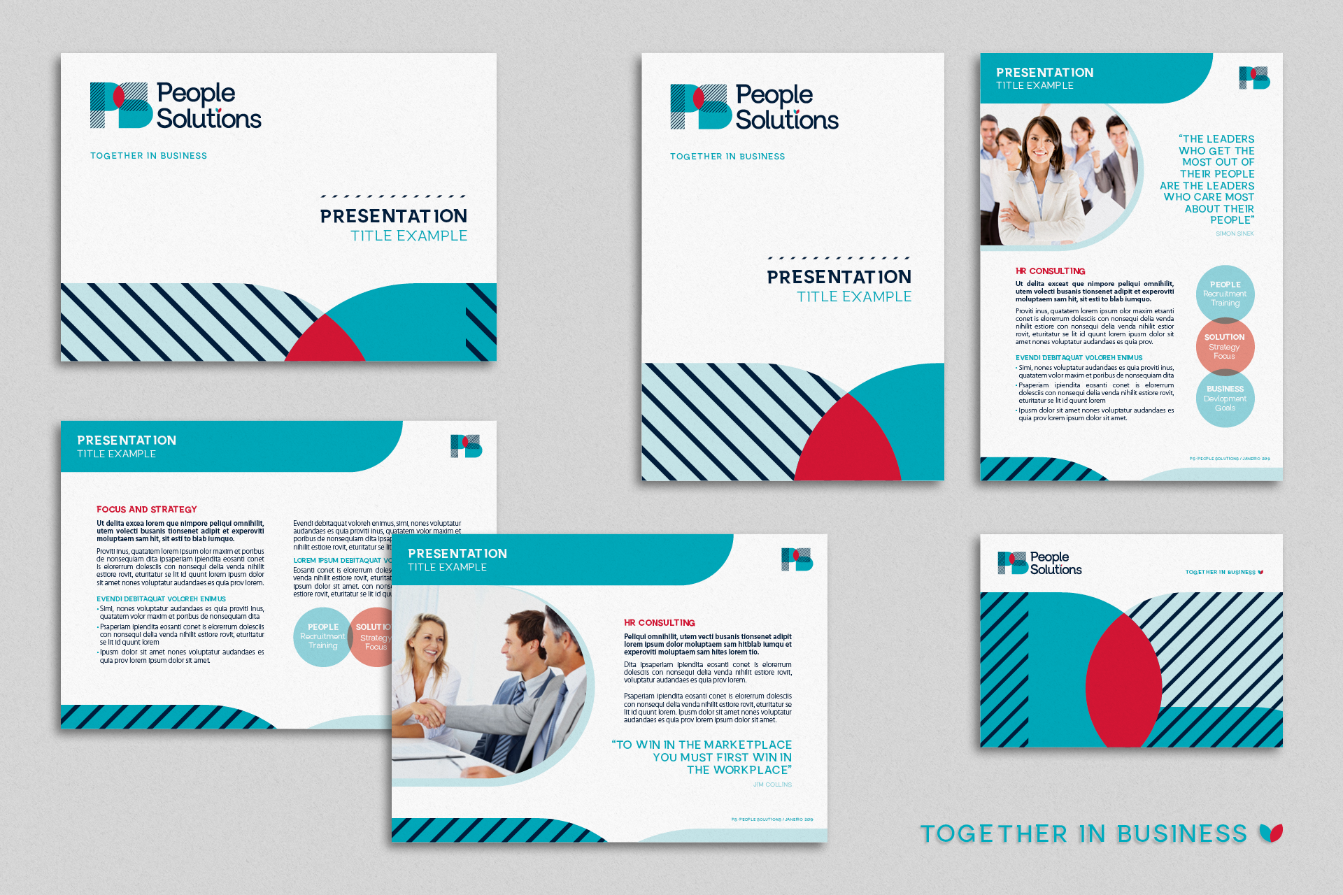
PS PEOPLE SOLUTIONS - HR COMPANY | IDENTITY PROJECT
Cohesion, synergy and empathy are core values that inspire the creative process, from logo to all other elements that set PS People Solution visual identity. The PS symbol, distinctive and stylized, suggests interaction, complementarity and unity; lettering transmits affectivity and proximity; color and signature also reinforce the brand’s intentions - an objective, pragmatic and creative vision, orientated towards solid and humanised solutions.
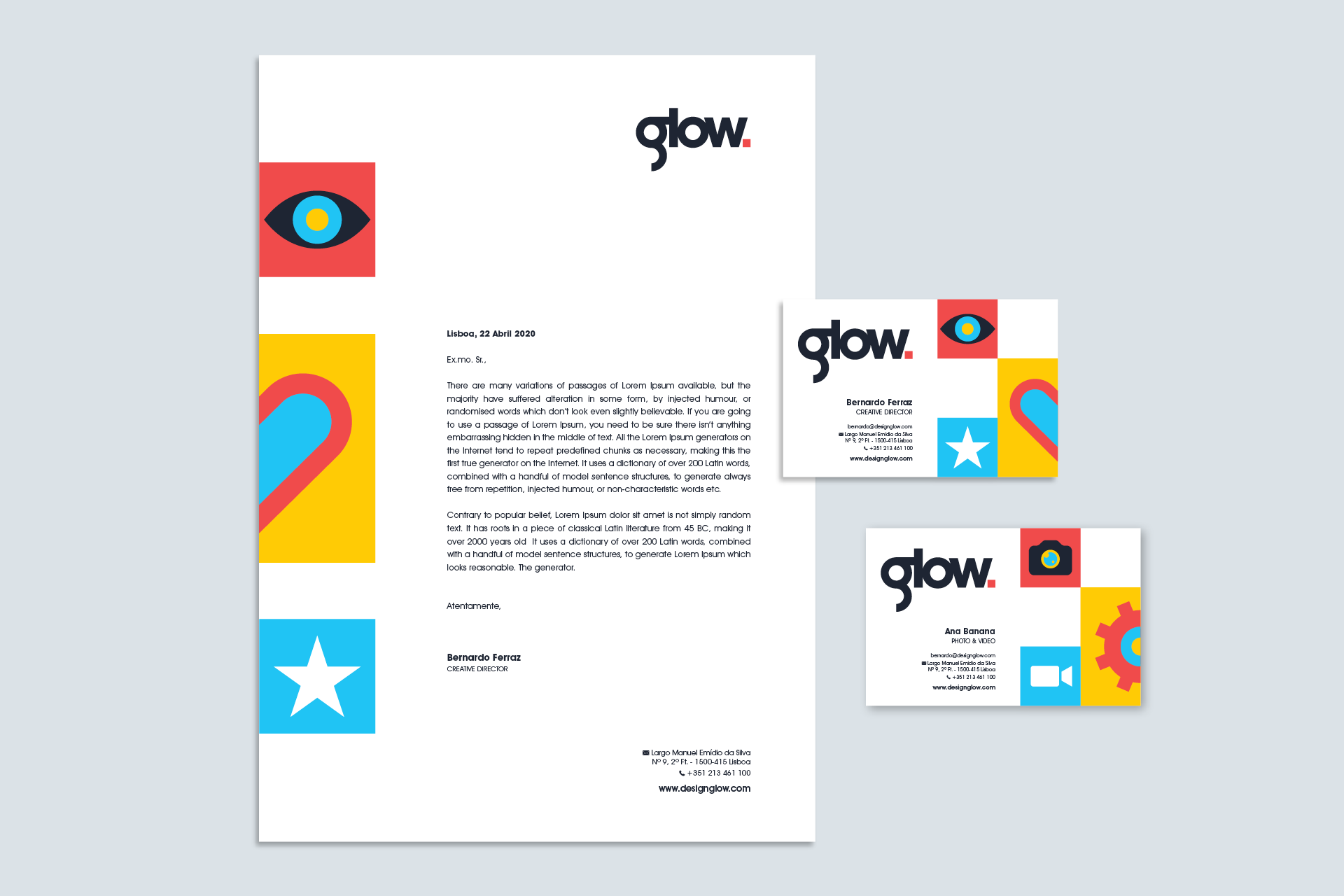
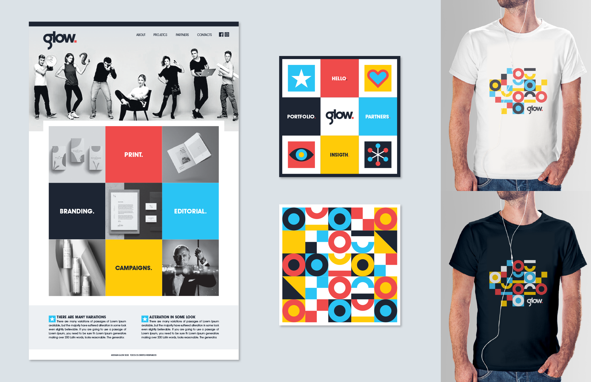
GLOW REBRANDING PROPOSAL
@ DesignGlow where I worked, all graphic designers were invited to redesign the company's visual identity. Not very extensive proposals were requested, but ones that give an overall idea of the visual potential. As it is a design agency with interests in other areas, through partnerships and collaborations, I chose to create a vibrant, energetic and very graphic identity, as well as plural and iconographic in terms of its work areas.
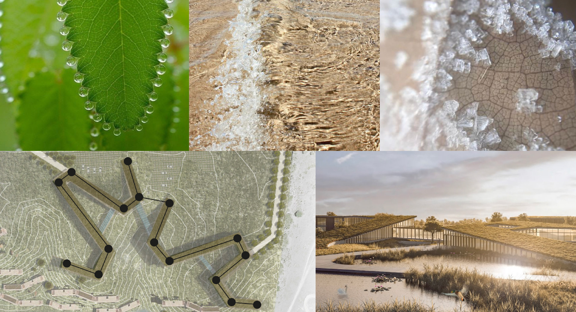
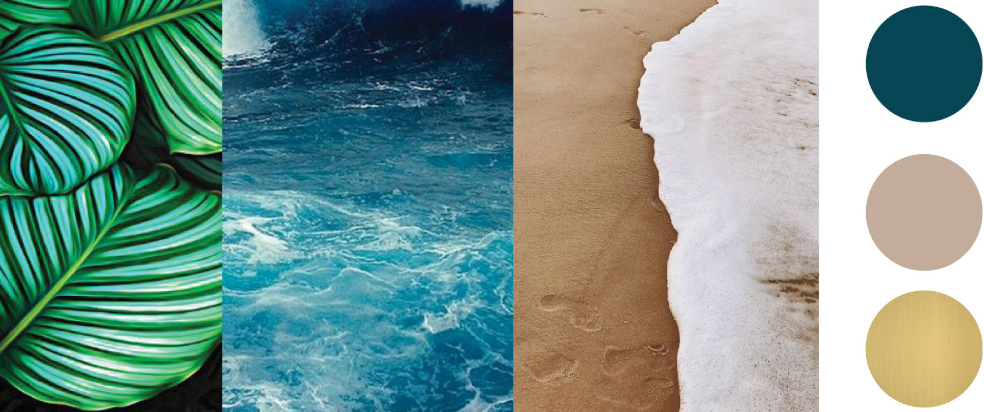
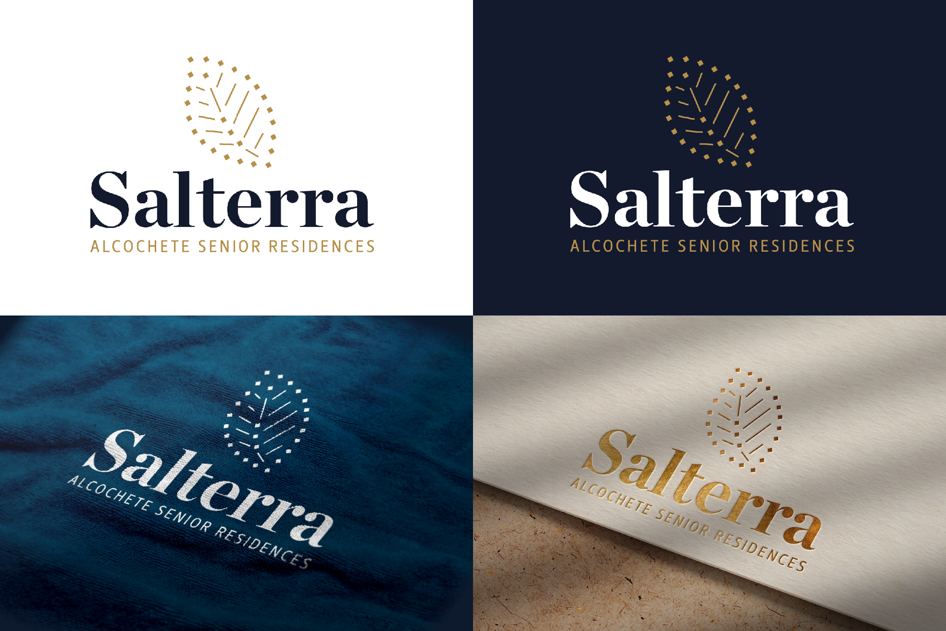
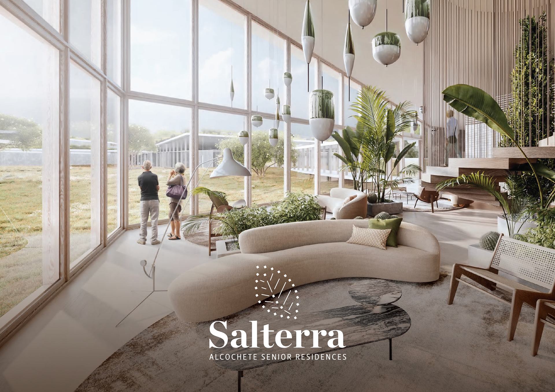
SALTERRA SENIOR RESIDENCES @ALCOCHETE | LOGO DESIGN PROJECT
Inspired by the architectural project, the brand's symbol intends to represent the relationship between the project itself and the surroundings, where salt, earth, vegetation and construction connects and intersect. The combination between it and a more classic typography leads to a conceptually rich and personalised brand.
INSPIRATION
LOGOTYPE AND APPLICATIONS
LOGOFOLIO | OTHER PROJECTS